Pantone has officially named Cloud as its Colour of the Year, a choice that reflects a growing desire for calm, balance, and simplicity in everyday living.
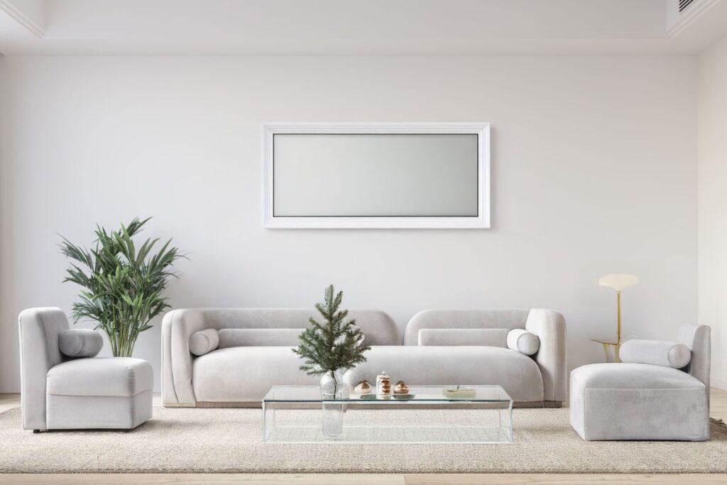
Cloud is a soft, understated shade that sits between white and light grey, with a subtle warmth that keeps it from feeling cold or clinical. It is gentle on the eye and creates a sense of openness, making it an ideal neutral for modern lifestyles.
Each year, Pantone’s colour selection captures the global mood. Cloud speaks to a shift away from excess and visual noise toward environments that feel grounded and intentional. It reflects a collective move toward clarity, comfort, and emotional ease.
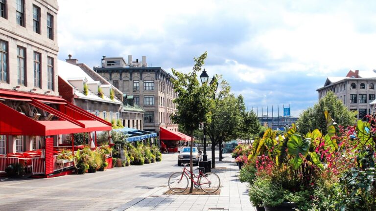
In interior design, Cloud has become a go-to colour for creating light, harmonious spaces. Used on walls, furnishings, or textiles, it enhances natural light and brings a sense of calm to a room. Cloud pairs beautifully with natural materials such as wood, stone, linen, and ceramics, allowing texture and craftsmanship to stand out while keeping the overall look clean and timeless.
Fashion has also embraced Cloud for its quiet elegance. The shade appears in relaxed tailoring, knitwear, and refined outerwear that prioritize comfort, versatility, and longevity. Rather than following bold seasonal trends, Cloud supports a wardrobe built on thoughtful, enduring pieces.
What makes Cloud especially compelling is its adaptability. It works across interiors, fashion, and lifestyle design while maintaining a feeling of softness and sophistication. More than a neutral, Cloud represents a state of mind rooted in balance, intention, and ease.
Cloud sets a gentle yet confident tone, reminding us that sometimes the most impactful choices are the quietest.
Jennifer M Williams | Editor-in-Chief